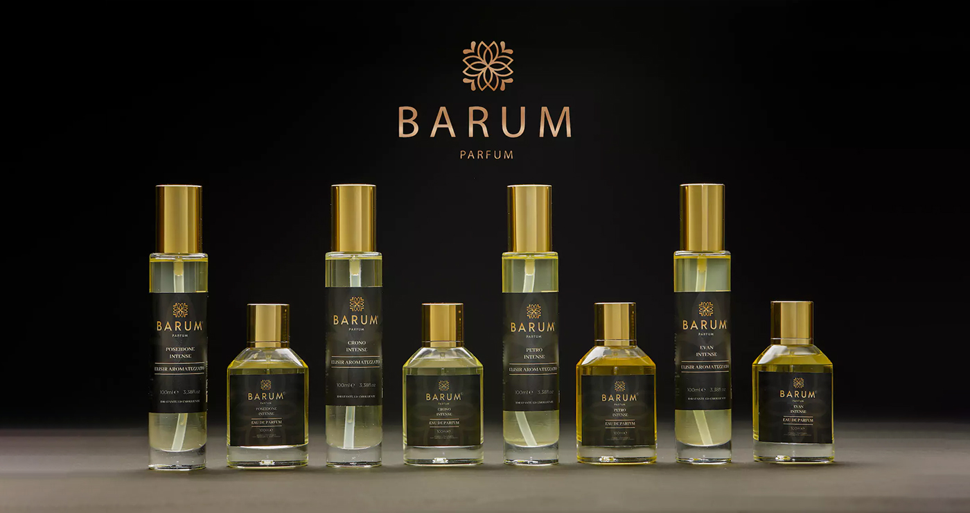
Barum Parfum is a Sicilian fragrance house rooted in craftsmanship, tradition, and the layered richness of Mediterranean culture. This self-initiated rebranding project explores how the brand’s identity could evolve through a contemporary lens — from logo and packaging to bottle design and visual storytelling. The goal: to distill Barum’s artisanal essence into a system that feels both refined and resonant, where scent, shape, and color speak a unified language.
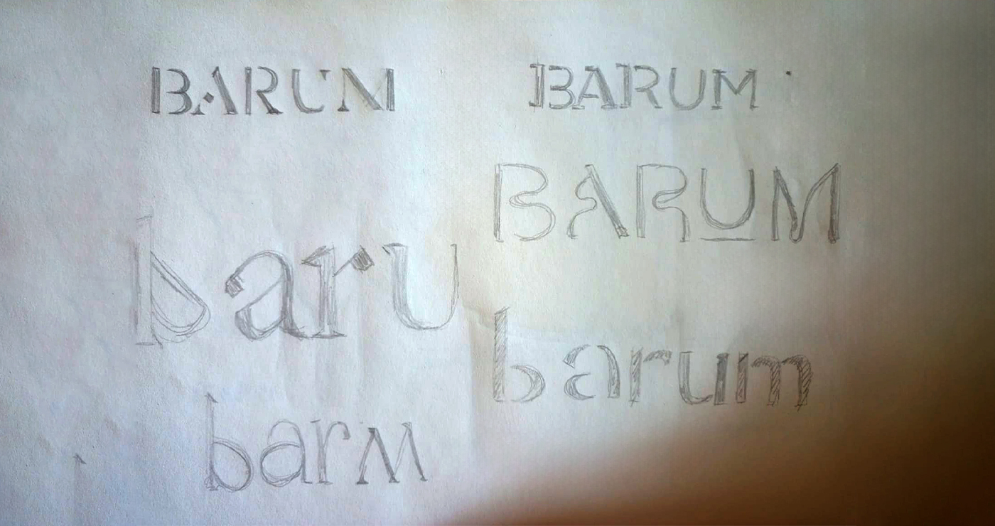
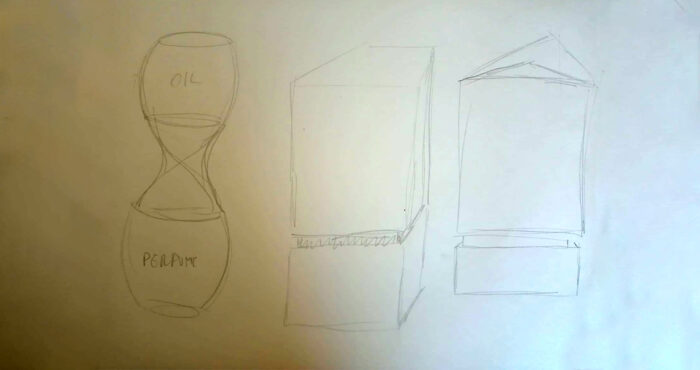
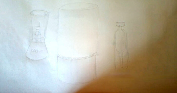
Every brand begins with a line. For Barum Parfum, the journey started with a series of conceptual sketches — visual explorations aimed at distilling the essence of a Sicilian fragrance house with a contemporary voice. These early drawings laid the groundwork for a rebrand focused on minimal elegance, symbolic geometry, and a bolder sense of luxury.
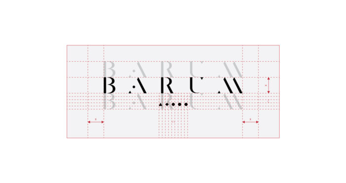
The logo was reimagined with a refined, geometric typography — clean, bold, and architectural. Each letter was meticulously constructed using a custom grid system, with sharp, diagonal cuts that evoke both precision and sophistication. The five minimalist symbols underneath represent Barum’s five core fragrances, introducing a coded system of shapes and colors that aid recognition while enriching the brand’s visual identity.



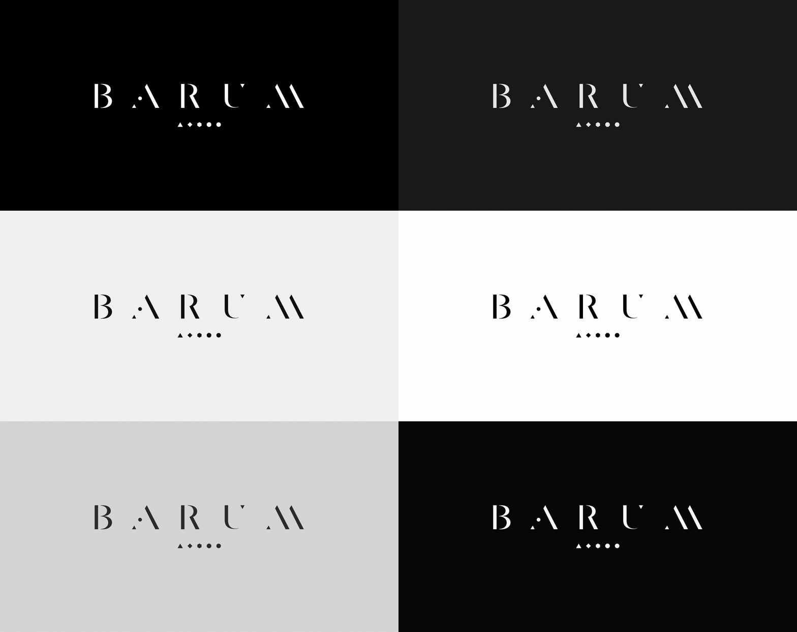
The idea was to pair each of the five fragrances with its own chromatic and geometric identity — a color and a shape that repeat across the logo, packaging, and print collateral. This synesthetic approach transforms the product line into a coded language of scent. It invites users to recognize, associate, and choose intuitively, creating a more engaging and emotional connection with the brand.
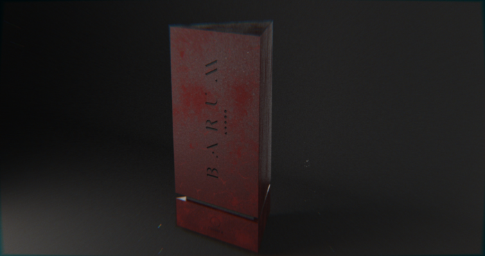
The proposed packaging is grounded — literally — in the identity of Sicily. I designed the box with a triangular base, a subtle reference to the island’s shape. This form becomes a visual anchor for the brand: stable, elemental, and unmistakably Mediterranean. The goal was to merge structure with storytelling, creating packaging that felt as crafted as the scents inside.
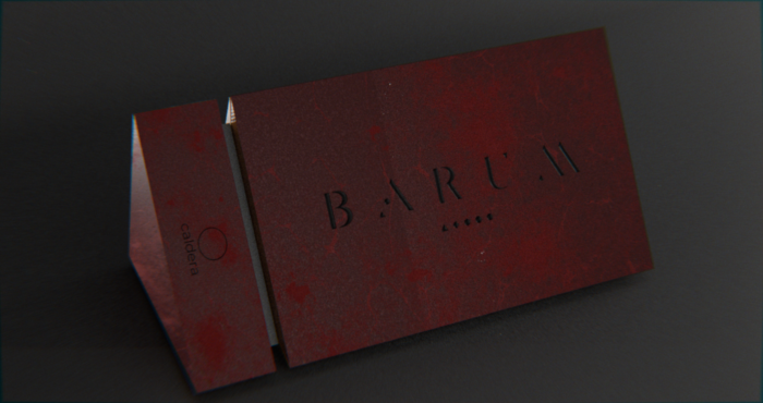
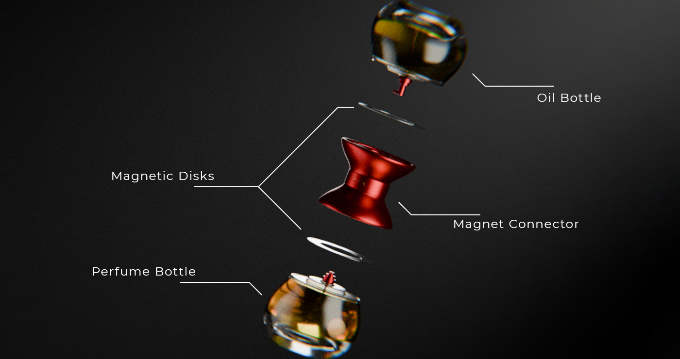
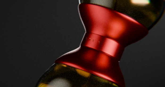
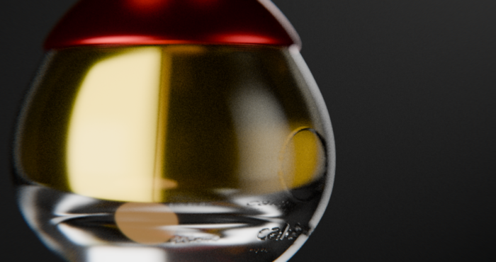
Barum sells each fragrance as a pair: a perfume and a body elixir. To reflect this duality, I redesigned the bottles with an hourglass silhouette — a symbolic container of time and balance. The form speaks to ritual and rhythm, suggesting a sensory experience meant to be layered, not rushed. It also captures the harmony between scent and skincare: two flows, one essence.
Although never brought to life, this rebrand stands as a crafted study of what Barum Parfum could evolve into — more contemporary, more legible, and more emotionally engaging. The client chose to stay the course. Whether that was the right call… well, you’ve seen the first image.
